30 Innovative Packaging Ideas
At the heart of any marketing strategy, packaging is the customer’s first contact with your product. To seduce and stand out with ease, it must meet a certain number of requirements. Different from other consumption media, it serves both technical issues and aesthetic objectives. Creators about to launch your product, how to design the packaging that will best serve your projects?
Here are 30 packaging design ideas to help you catch a glimpse of the many possibilities available to you.
What Is Packaging For?
Developing an effective packaging design means ensuring its practicality, its agreement with the product and its influence on the consumer. Above all, it is he who must allow safe transport, but his function goes far beyond. True promise, it is a way to arouse a positive emotion well before the purchase. Make your product visible among hundreds of others and establish a relationship of trust with your customers.
And besides, how do we go about it?
Think Design
To reflect on its design is to take into account all the technical, budgetary and environmental constraints to which to submit. Indeed, you have to choose the right material and anchor yourself in the trends of the moment while staying true to your brand.
In this regard, 3 fundamental questions are worth asking:
- What is my product? This will determine the requirements to be met in terms of packaging.
- To whom it is addressed? Target its audience in order to attract the ideal consumer.
- How will my product be sold?
The packaging of a product sold on the shelves will necessarily differ from that of a product offered on the Internet. Design is the answer to a particular question. You are given a problem to solve and then you let the problem itself give you your solution.
3 0 Packaging Design Ideas
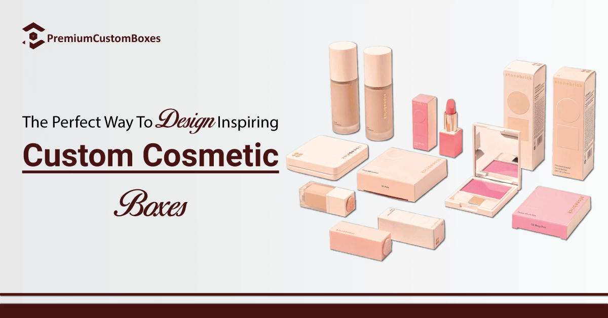
Need ideas for your future creation? Inspiration is necessarily found in the unique packaging that we have put together for you. Keeping in mind that it is not you should seduce but your consumer! We take care of its cosmetic product packaging. Product developments in the cosmetics sector directly impact that of packaging.
We explore shapes, textures, colors with the same care that perfumers use to develop a new formula. High-end products among the most widespread, cosmetic packaging now oscillates between elegance, innovation and simplicity.
A delicate balance resolutely turned towards the modern!
01 – Bet on Simplicity
On the contrary, it is often much more meaningful than an overloaded design. It is a way of communicating frankly with an increasingly demanding public. Be honest and transparent and count on the quality of your product to get the rest of the way.
Designed like milk packaging, this packaging design for cereals seduces with its clean but effective visual. The raw cardboard evokes the natural while the pastel shades create a gentle contrast. We appreciate the ear of wheat simply represented and which echoes the name of the brand. In a word, a modern and attractive design perfectly in line with the quest for authenticity shown by today’s consumer.
02 – Tell a Story
A good packaging design will be one capable of telling a story. To transport the potential consumer into a universe that they will enjoy browsing. People love stories, tell yours! This is how the Balancium brand opted for a suitcase-shaped box for its moisturizer. At the opening, the consumer has the joy of discovering the product planted in a pleasant nocturnal setting.
Then everyone’s interpretation! The opportunity to transport a whole world through a collection.
03 – Strictly Adapt to The Product
Whatever the packaging design chosen, it is the product that remains essential! Above all, it is he who imposes forms and materials. But don’t let your imagination run wild, a multitude of ideas are at your disposal. Thus design the idea that adapts to the product.
For its rice milk soap, the Calendula brand has opted for packaging specifically adapted to the product. The information mentioned disappears from view when the cover is put in place. Once closed, the product intrigues and catches the eye with its striking leaf appearance. Content comes before design. A design without content is not a design, it is a decoration.
04 – Try The Metallic Colors
The trend for metallic colors has not yet run out of steam. Behind its modern appearance, metallic offers depth and contrast whatever the shapes and colors. The metallic flowers of the cosmetic packaging catch the eye long before the product name, black on a dark blue background. Intrigued, the consumer then approaches to find out what it is.
And the surprise continues at the opening with striking shades of light!
05 – Find Your Style
At first glance, nothing is easier, and yet it takes time to develop your own imprint. Think about your audience and your product to consider the best way to reconcile the two. Rather vintage, colorful or luxurious?
The main thing is to find the visual element that will make you recognizable among all the other references. Creator of playful and decorative objects, Mr Wonderful is distinguished by the quotes in large characters affixed to his products. On the packaging side, we notice the recurrence of certain elements:
- A generally half-opened package.
- Sober forms and predominantly raw cardboard.
- A little note of color to enhance everything.
- The brand logo indicated legibly.
And you, what will be your trademarks?
06 – Play On Pastel Shades
Who said pastel was bland? On the contrary, it seduces more than ever with its soft notes and is available in a wide palette of tones. Perfect for canning various products from the same range! And then, beyond nude and electric shades, pastel has become a permanent fixture in the cosmetics sector. A risk-free choice compatible with all fantasies.
May be combined with fine illustrations and airy instructions to enhance the softness as above.
07 – Offer An Experience
Protect and sublimate yes, but it is possible to go much further. The first point of contact between your brand and consumers, the packaging design is conceived by thinking of the offer, the brand image as well as the moment of discovery.
So we play on the development for an experience as unique as your creation! Especially since in the virtual age, there is a good chance that everything will end up on social networks. And that, Kat Von D understood well. Its packaging remains in accordance with the visual codes of its brand but promises an unboxing rich in surprises that will certainly seduce the customer.
Product, motif, information, each element finds its place in harmony with the others. What finesse!
08 – Do Not Neglect Aesthetics
Perhaps obvious but it is easy to get lost while looking for originality! The cosmetics sector remains a sector of leisure and elegance in which the eye scans the shelves in search of the beautiful. The simple effectiveness of packaging with worked finishes will often be able to meet the needs of your brand. You should add aesthetics even to your cereal box design.
Also, bet on the dream, the poetic and the refinement to offer a real added value to your collections. What could be more poetic and stellar than a night blue packaging studded with stars? Information easily finds its place there.
In addition, the product itself presents on its tube the small details that will make all the difference. PCB is able to help you create the same packaging with gilding. We surprise with original packaging. Creating a surprise to always stand out more remains a sure bet in terms of marketing.
How can you be seen on stalls if you don’t look like anyone else? Originality is a way for you to assure the consumer that your product is the one they need. The advantage is that many options will allow you to achieve this goal.
09 – Think About The Aftermath
What happens after the product is discovered? Increasingly, we now appreciate being able to keep the packaging. What a wonderful idea to transform an easily transportable wooden packaging into a bottle display! But it can also be a packaging with a strap which will become a bag.
Or a pretty box that will be kept as an object of decoration or storage. The opportunity to offer your packaging a doubly practical function for protection and transport.
10 – Be Ecological
For a long time now, the trend has been green! But then how to be original while conforming to the codes of the moment? What you need to know, that ecological packaging allows a multitude of shapes, colors or recyclable materials. Exit plastic, we want cardboard in line with sustainable development!
The use of recyclable cardboard will generally incur little additional cost. But the image of the company in the long term will be significantly improved. Sober but with a strong personality, these pencil cases serve their purpose with ease. The raw cardboard is a call to the natural while the cut country shapes open up to the world.
The touch of color brought by the sight of the product is essential, and very balanced. The information is clear and succinct, to get straight to the point. PCB has a separate department which handles all cardboard boxes.
11 – Play The Homemade Card
We also note a return to traditions and simplicity as so many guarantees of quality . And here again, the home-made call for raw materials and sobriety. A simple box, a do-it-yourself kit and illustrations giving the impression of having been drawn by hand. In other words, the perfect illustration of home-made!
12 – Dare The Bright Colors
Simply catch the eye with a variation of rich and vivid colors! A way to dress your packaging without having to do too much. And a way here to be perfectly in tune with the tart colors of the shirts. The palette of colors makes it possible to differentiate each of them while offering a coherent range.
The paper pocket remains sober but carefully worked (sides, patterns, colors) in order to remain the privileged support of the shirt that it will present to the view. Do not hesitate to use a Pantone type color chart to get the right color tone.
13 – Be Funhumor Packaging Idea
Why deprive yourself of the possibility of drawing smiles on your faces? An ideal way to enhance your product while adding the quirky touch that will necessarily be attractive . Like these brushes presented in the manner of mustache faces.
Funny and fun without harming the product, there is no doubt that this packaging has been effective!
14 – Address The Customer
E-commerce sellers, perhaps you are used to putting a small handwritten note in your packages. And you know how much it contributes to the customer experience. So why not address your customers in store? Adapted quote or funny little sentence, the idea being to permanently establish a close relationship between you and your consumers.
These tulip bulbs with simplistic bellows packaging appeal directly to the customer through their packaging. A childish side reinforced by the illustration and the choice of typography but which remains extremely impactful. Do not hesitate to use this technique to improve the emotional dimension at no additional cost!
15 – Come Back To Vintage
Fashion, this eternal new beginning… In product packaging design, moreover, vintage is more popular than ever! First of all, retro sells well because it offers this feeling of authenticity which is very popular with today’s consumers. And then the aesthetics worked necessarily has something to seduce.
Hello colorful patterns and quirky typography, vintage also gives a feeling of experience and superior quality. Bright pink candles, and why not? Presented in a pretty box with the scent of yesteryear, they are in possession of serious arguments to stand out from the competition.
16 – Think Of The Gift Idea
Attract the consumer yes, but it will be good to open up to other options. Maybe he is buying not for himself but for someone else? In this case, dare to offer carefully crafted packaging that will find its place on all occasions. And we take advantage of the seasons to vary the themes!
An atypical box with degraded shades, a pretty ribbon for a little attention ready to offer. The opportunity to facilitate the work of the consumer who generally appreciates the initiative!
17 – Create Something With Your Product
Shape something new with the product you offer, what a great idea! As long as you respect this, of course. An additional means of clearly expressing to the potential consumer: “I care about your experience”. It does not necessarily have to be a cosmetic product. You can experiment even with custom CBD boxes and we have.
Here, the matches are presented in a cardboard case whose shape evokes that of chic lighters. The little retro side is already very appreciable and the tip of the matches, of variable color, is a way of looking after your product in every detail!
18 – Make Yourself Fun
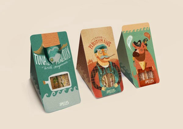
In the presence of two products of similar appearance and price, it is at the packaging level that the choice will be made. So why not have fun and have fun in return? Do not hesitate to seize the chance to propose a playful packaging design. Simple but terribly attractive, this hanger-shaped box is synonymous with attention to detail.
In addition, it is an excellent gift idea without requiring any packaging! To choose without hesitation. Source of pleasure and moments of sharing, gluttony is far from being an ugly flaw!
Now, moreover, it makes extensive use of aesthetics in terms of products such as packaging, sometimes even edible. The opportunity to delight the eyes of your customers, increase the feeling of quality and arouse envy without even the presence of the product itself.
19 – Trust The High-End
Luxury packaging is ideal for any type of product, including the most unexpected. You have the packaging with neat interiors and precious colors whatever your sector of activity.
Floral patterns cut out on a deep night blue, chic purple interior perfectly adapted, this box promises to offer a real experience. We will focus here on dark shades enhanced with a few bright elements for the touch of refinement.
20 – Surf The Trend Of Made-In USA
At the time of the proliferation of large brands, we note the return of an affection for everything that is good from home. Are your ingredients, your production, your materials American? So let us know! Consumers looking for excellence want more.
21 – Trust Black And White
Simple, natural, good, we want to get to the point! Together, black and white help create a strong dynamic. They clearly establish contrasts while forging a real relationship with each other. For a minimalist aesthetic, a simple white food packaging enhanced with black typography (or vice versa) will give the feeling of a different product.
And what is different inevitably arouses curiosity.
22 – Clearly Inform The Consumer
As we have seen, consumers today are more demanding than before. In terms of food especially, it is a question of buying quality products, American if possible, and offering the greatest transparency. So take the trouble to offer your potential customers the information they are looking for (traceability, advice on use, anecdotes, etc.). A way to build loyalty by offering a qualitative supplement to your products.
Brightly colored banner, type of dough written in large letters, you can’t go wrong here. Especially since the back of the package certainly offers a lot of additional information. The little extra? A graphic packaging far from what we are used to seeing for a perfectly surprising product.
23 – View Your Product In Store
You are sure of it, you have developed an exceptional product. Like these little marshmallows with original flavors. Yes, but how do you adapt your packaging to shelving? Does it attract enough attention among all the other references?
It is one thing to take care of the details once the product is in hand. However, it is also about being visible from afar. Develop your concept and unique meeting so that the consumer notices you with ease.
A well-defined color code, a nice logo, essential information and the retro side that we appreciate … The competitors on the shelves will be wary of these small square boxes.
24 – Allow A Look
Where aesthetic work alone is not enough, it is up to the product to defend itself. Creating an opening allowing a glimpse of the merchandise is an additional means of being honest with the consumer. Here, the product is staged in a neat-looking packaging capable of taking us specifically where it wishes. The organic label is reinforced by the raw and natural aspect of the whole.
The touch of color offers an attractive contrast. The silhouettes of animals and the name offer the playful dimension appreciated by many consumers. Realizing a packaging design idea is finally constantly improving to adapt more and more to requirements. It is to arouse surprise and open up to possibilities sometimes never exploited!
What will the packaging of tomorrow hold for us?
25 – Try Transparency
Asked to rethink the packaging of the famous Nike Air Max, the Berliners Scholz & Friends opted for an extreme design, inspired by the air bubbles present in the shoe. Aesthetic? The debate remains open.
But the initiative does not leave indifferent in any case. What could be more sincere for a creator than to offer his product in a packaging while transparency?
26 – Confuse The Consumer
Learn to be where you are not expected! Dare to transform your product into what it is not to multiply the surprise of the consumer. These elegant boxes in the shape of precious stones do not contain cosmetics but cookies. Do not hesitate to move your product away from its original appearance.
27 – Minimize Waste
To always go further in ecological packaging, why not turn to zero-waste ? A way to attract consumers who are sensitive to the environmental cause. And a way to give your brand a real mark.
Pretty little paper bottles, a shape that facilitates handling, a small decorative touch … A beautiful product in keeping with the times, whose simplicity would be enough to catch the eye on a shelf, in the midst of other references.
28 – Push Your Limits
When it comes to seducing and standing out all the time, know how to take risks. Know how to explore new directions to make an impression. This is the bet made a few years ago by the Festina brand. Watches submerged in pockets of water, to demonstrate their waterproof ability.
You had to dare, and it worked! Very selling, the marketing coup allowed the sale of a good number of stocks. And you, what extreme innovation will you turn to?
29 – Be Creative
Creativity is a bit the common thread of all these ideas and those still to be born. But it deserves to be mentioned again. Good packaging means offering the sensation of a good product, so don’t deny yourself any originality!
When we think that these crackers could have been piled up in a sachet or a cardboard box. On the contrary, here they are elegantly arranged as if they came out of the oven. The quality of your product skyrockets, the customer experience is increased tenfold. And your brand has managed to strike a blow which will facilitate the exit of your following ranges.
30 – Stay True To Yourself
Create packaging idea true to your values. Latest packaging design idea and perhaps the most essential of all. Take the time to study what your product represents and let it show through in your packaging.
A bouquet of flowers for example? Elegant and romantic, opt for neutral shades enhanced with a little passion red. Placed in a pretty transparent box, your product suddenly takes on an additional dimension. And it is your brand that benefits from this added value. To think about for each product. Surprise, dare, innovate yes, but your brand must appear behind each of your decision-making.
Develop Your Packaging Design With An Online Printer
For a rendering that matches your projects, trust a professional printer. The opportunity for you to have in particular the information essential to the creation of your design, for an optimal impression.
PCB provides you with all the tools you need to design the packaging that will only look like you.

